Avianca El Salvador Logo
Avianca el Salvador, better known as TACA – is one of the biggest airlines in Central America and a crucial one for Latin America as a whole. It’s a Salvadoran company, so when they merged with Avianca in 2013, they adopted the name of Avianca el Salvador, although for all instances. It’s still often called TACA.
Meaning and History
TACA is one of the oldest companies in this field in Central America. It’s been founded in Salvador in 1931. The acronym TACA is derived from their former full name that in English stands for ‘Air Transports of American Continent’. Basically, they were aiming for providing flights all over America, and they largely succeeded.
1931 – 1936
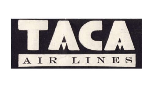
The first logo was the acronym ‘TACA’ written in big, blocky letters, accompanied by an occasion word ‘air lines’, usually below and written in thin serifs. The colors could change, but the usually would be either black or white. The only unique feature about them was the inclusion of a triangle instead of the ordinary central lines for ‘A’s.
1936 – 1948
The design introduced in 1936 was later used for about the rest of the century, although in different variations. It’s a turquoise oval of sorts (that being the country’s national colors), encircled by a frame of darker blue and riddled with all sorts of writings and images.
The central of the mall is a red parrot with yellow and blue plumage in places. The same color palette was used in the tropical landscape below and partially in the ‘TACA’ acronym above. This one was the same style as in 1931, but almost completely red.
Simultaneously, the frame around sported a full company’s name – what each letter in the acronym stands for – in yellow.
1949 – 1966
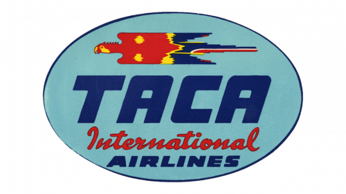
The 1949 design was inspired by a previous attempt, except this one was way simpler. It was just one turquoise oval with images and writings orderly arranged from top to bottom, including: the parrot, the acronym (now in massive blue letters) and the new ‘International Airlines’ inscription.
That last part was in reality two elements. The first word was a cursive red text, and the one on the next line was smaller and inspired by how ‘TACA’ is written here.
1966 – 1999
The 1966 redesign was actually even softer. They opted for a darker shade of blue now instead of the turquoise and rearranged most things, while the structure mostly stayed the same.
The parrot was simplified and mirrored, the acronym now shone pearl white, and the last two words were now the same soft font inspired by the acronym, yet thinner and sand-colored.
1999 – 2008
The new concept introduced in 1999 was even simpler: just the acronym followed by a minimalistic-enough emblem. The former was now a thin serif inscription colored in dark blue. The latter was now five identical parrots inspired by the one from previous design. These ones, however, are a color of gold.
2008 – 2013
In 2008, they sort of reused the 1999 concept, but changed the imagery. The colors on the letters changed to a slightly paler shade, and the font wasn’t a serif anymore, but just some soft decorative type. The parrots were gone, and in their place the company put a red tail plumage – which was just a collection of red paint strokes.
2013 – today
In 2013 (after the merger), they adopted the logo of Avianca precisely as they use it. The company name is written in the usual typographic letters here. The emblem is now Avianca’s iconic bird – a head with two wings attached to nothingness behind. Both are completely red.
Emblem and Symbol
It’s important to note that the planes and much of other properties of these airlines didn’t use the logotypes as they are presented by the company. The planes in particularly would take the essentials (usually the brand acronym and the parrot emblem) and put it on the plane in different areas.


