Continental Airlines Logo
Continental Airlines was a huge air carrier in the United States, having the fleet of 350 aircrafts. It operated domestic and international departures in 140 flight routes and connected the country with the partners across the world. The main bases and hubs of the company were located in the airports of Cleveland, Guam, Houston and Newark.
Meaning and History
The company now known as Continental Airlines was founded by Walter T. Varney in the year 1934 as the airmail and passenger service named Varney Speed Lines. After the chief was changed to Robert F. Six, the company name turned to the Continental variant. By this, Six showed his heading to spread the company operations across the whole continent.
Who owns Continental Airlines?
The airline is basically owned by United Airlines. However, the brand itself has been inactive since 2012.
1934 – 1937
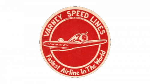
The very first trademark was in use by the company in the start, until it was bought by Six. It depicted the initial name over the red circle with the white in-lines. There was also the company motto – ‘Fastest Airline In The World’. As the dominant part, the brand designers put the depiction of a flying airplane with the Walter T. Varney’s surname on the wing.
1937 – 1960
After the acquisition of the company and its rename, Robert Six changed the logotype as well. The new brand mark depicted the image of an eagle with the new corporate name. The eagle was located over the thin circular collar. All the logotype’s elements were shown in the colors of the United States flag.
1960 – 1967
The following corporate trademark represented the familiar eagle, but that time in completely another position. It was colored beige and placed in the oval shaped frame of the same color. The eagle was halved by the bold black word ‘Continental’ (which was also above the oval), and in the part below there was the white-colored ‘Airlines’ explanation.
What is Continental Airlines?
The company was a major American airline. Currently, they’ve ceased operations.
1967 – 1991
In the year 1967, the brand designers continued the experiments with the corporate logo. The new watermark had the serious and angular sans-serif inscription ‘Continental Airlines’, placed below the emblem of the red circle with the white ‘air’ lines on it. That logotype was in use by the company for over 20 years, until it was changed again.
1991 – today
The last logotype was in use until the ceasing of the company’s operations in 2012. It featured the blue serif inscription with the company name, having the dominant position in the entire logotype. As for the emblem, so it featured the white-colored globe, placed on the blue square background.
Emblem and Symbol
Where does Continental Airlines fly?
Continental Airlines mostly flew around the United States. Around the half of the destinations were still abroad: in Europe, Asia and South America.
Though the company was merged with United Airlines, the Continental emblem is still in use as the mark of the United Airlines proper. It can be seen in various color palettes, such as black and white or dark-blue with addition of white and glassy red lines. Due to its simple structure, the logo is easy to use according to the background or some event.


