Raytheon Logo
Raytheon is a large American conglomerate of various high-tech companies. They make everything from electronics to aerospace products to weaponry. Their biggest client is by far the American government, and they are considered one of the most crucial components in the national defense system.
Meaning and History
Originally, Raytheon Company was created in 1922 by two engineers from Massachusetts. One of their first creations was a radio tube they named ‘Raytheon’ (which in Greek means ‘divine light’). It later evolved into the name for the company as a whole, owing to its catchiness.
Who owns Raytheon?
Raytheon Technologies is an independent entity. They are, however, a result of a merger between Raytheon and United Technologies.
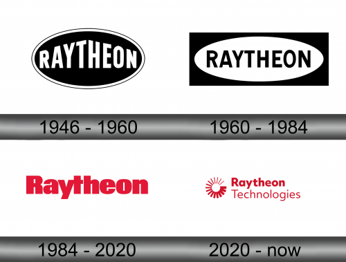
1946 – 1960
The initial logo was an oval with white outline around it. Inside it, they put the name of the company in capital letters. Peculiarly, they decided to gradually inflate the inscription the closer to the middle it got, which made the name look angular and symmetric.
The usual colors would be white for the letters and blue/black for the oval background.
1960 – 1984
The second logo featured a wider white oval inserted into a black rectangle. The company name was put inside the oval and written in much the same style as before, but without the inflation.
1984 – 2020
In 1984, they instead decided to purely use the brand name. The font changed to a fatter serif inscription written with lowercase letters as well as uppercase. The color was red this time.
2020 – today
In 2020, Raytheon merged with United Technologies and formed Raytheon Technologies. It’s a red amalgamation of an emblem and two inscriptions. The emblem is a sign of loading in computers, with an increasingly denser concentration of lines progressing clockwise.
The written parts were on its direct right and said ‘Raytheon Technologies’ in two lines and two different styles. The upper part is the thick sans-serif writing, while the lower one is mostly the same, except much thinner.
Emblem and Symbol
What is Raytheon?
It’s a company that dabbles in all sorts of scientific research. In addition, they make high-tech planes and other transport.
The ‘loading sign’ from the 2020 Raytheon logo is taken directly from the latest United Technologies emblem. Despite being present on the official logotype, they don’t use it too widely. Their products aren’t usually decorated with the symbol, because they make machines and sell them to US Government afterwards.


