United Airlines Logo
United Airlines is one of the three biggest airlines in America, as well as a major provider for the entire world. Although most of their flights take people across the United States, they also make a lot of hauls to the other four continents. In terms of fleet size, it’s only outshined American Airlines.
Meaning and History
The company was created in 1926 by Walter Varney, and it was for a few years a subsidiary for Boeing. In 1930, they became a fully independent company and thus adopted the new name – United Airlines. Like many other pioneer American airlines, they tried to draw from the American aesthetic, hence the ‘United’ part.
What is United Airlines?
It’s one of the biggest airlines in America. They compete with several others to be the country’s flag carrier, but there isn’t one at the moment.
1930 – 1933
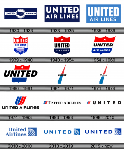
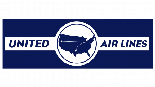
The first logo was a strip of dark blue with the country map of the same color put in the middle of it. The map had several airports in Los Angeles, Houston and Chicago dotted and linked with lines. Furthermore, they put it right into a white circle with was then surrounded on the right and left by the white strips with words on them.
The words simply said ‘United’ & ‘Air Lines’ in simple sans-serif letters.
1933 – 1935
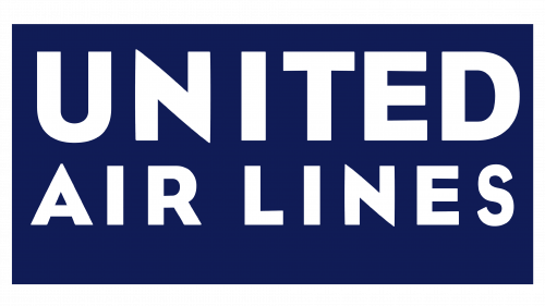
Most stuff in this logo is reused parts of the old one. They took the writings from the original one, colored them white and removed the tilt. The letters are much bigger here, and the words had to be arranged in two lines. Then, they put the entire thing onto a dark blue rectangle, much like before.
1935 – 1939
In 1935, the background was turned to pale blue instead. The letters also changed: the ‘United’ part in particular had a much bolder, tall style. The other words, by comparison, were smaller, slimmer and rather closer than before.
1939 – 1940
In 1939, they introduced a shield design – the usual medieval shield shape with three pointed tips above. They’ve colored it with three stripes of red, white and blue from top to bottom. The written parts were just slightly altered and then divided between the red and white spaces.
The rest of the emblem (almost the entire lower half) was given a new image – a pale map of US with a white line connecting both coasts. The very bottom said ‘from coast to coast’ in white.
1940 – 1954
In 1940, they got rid of everything except the written part (almost exactly as it has been). This time they divided these between the white and blue elements, while the red one was given a single white star to finalize the American aesthetic.
1954 – 1960
The basically tilted the whole thing, including both the shield shape and the letters therein. The letters did also become shorter and thicker (as did the shield, anyhow).
1960 – 1961
The shield got narrower and now only had the word ‘United’ written across its middle. Notably, it grew in size and surpassed way beyond the shield’s boundaries.
1961 – 1971
In the shield’s stead they introduced a sort of cone with the same positioning and coloring. That’s likely supposed to resemble a plane’s trail in the sky. The word ‘United’ is still right in the middle, except much smaller, blue and cursive.
1971 – 1974
In 1971, the word ‘United’ became black and larger.
1974 – 1993
1971 saw the introduction of a new design – a shield-like shape, except made with 2 blue and 2 red knots. Right below it was the full name of the company, now written as ‘United Airlines’. The font changed to a soft, bulky sans-serif.
1993 – 1998
The shield emblem was moved to the left side, and the name stretched from it and all the way to the right. The letters also became more typographic, serif and more orderly.
1998 – 2010
Everything stayed as it were, except they got rid of the ‘Airlines’ and placed the rest of the letters further apart. The font also changed to the one they used with the original shields.
2010 – 2010
They introduced a new design again. This time it was a blue square with a section of a white globe (divided with a grid) occupying a good half of the thing. On its immediate left was the writing – the full company name written in blue using a serif font. It was much like the 1993 design, yet somewhat different.
2010 – 2019
The sole change here is the font redesign – this time it’s the one from the 1998 variation, except with broader letters and blue.
2019 – today
The 2019 logo has a slightly darker shade of blue, and the brand name was now in its full form, although the font didn’t change at all.
Emblem and Symbol
Where does United Airlines fly?
It’s a global airline with destinations all over. America is obviously favored.
The United Airlines planes have a distinct livery of a white gridded globe put which they place right onto the vertical stabilizer, colored in blue. Some variations prefer to have a slight red tint along the grid lines, because it resembles the national colors of the United States, and UA is one of the biggest airline companies in the country.
