Yahoo! Mail Logo
The twenty-year history of this company is full of both achievements and failures. The Yahoo! brand has made a name for itself. However, the company failed to fully recover when its stock prices along with many others dropped significantly at the beginning of a new century. Nonetheless, Yahoo! Mail has a huge part of users from all over the world (225 million users as of 2020), successfully competing with Gmail. Unlike any other email service provider, Yahoo! Mail users can access Yahoo! mail through other non-Yahoo emails such as Gmail, AOL, and Outlook as well as manage multiple accounts.
Meaning and History
The American IT company Yahoo! appeared much earlier than its strong rivals. Yahoo! was founded back in 1995 by two Stanford alumni. Their main strategy was to add more and more new services. Until 1997, Yahoo! Mail was an independent mail service called RocketMail. In 2016, the mobile operator Verizon managed to absorb Yahoo! for a very low price. The same year, it was published that at least several thousand million user accounts had been compromised a couple of years ago. It was not only the biggest data security breach but also the biggest one in the history of the computer industry. There is a version that Yahoo! is the university nickname of David Philo.
What is Yahoo! Mail?
Yahoo! is one of the largest American companies that includes a search engine, an internet portal, and an email service. Once hooked on Yahoo!, millions of users around the world no longer get off it. It is especially popular in Japan.
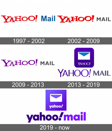
1997 – 2002
The original logo featured only a wordmark without any additional elements. It was the word “Yahoo!” written in bold red color with all uppercase letters that had wide serifs. All the letters were placed on different levels, which added dynamics and a fun element. To specify the type of service, the word “Mail” was written next. It was done in a blue, basic typeface without serifs.
2002 – 2009
The word “Yahoo!” acquired a shadow, which gave it some volume and allowed it to stand out on any background. Otherwise, the font and its style have not been changed. The word “Mail” was written in all uppercase letters and in dark gray color to go along with the shadow and not get lost.
2009 – 2013
The new update was quite minimal. It was only the “Yahoo!” portion that got the shadow removed and changed color to purple after so many years of being red.
2013 – 2019
For the first time in many years, “Yahoo!” was written using a different font. It kept the same idea with “O”s of different sizes as well as the proclamation sign that was italicized. There were no more serifs, while the color was a blend of purple and blue with darker shades being used for shadows to create a very angular 3D effect. The word “Mail’ was enlarged.
2019 – Today
Although the company did not add any other elements, the way its name was written completely differed from the original one. The whole wordmark used only lowercase letters. The font featured an otherwise basic font with rounded elements and no serifs.
Font and Color
For the first fifteen years, the company used the same font for its logo. Red, a color of power and energy, was the main color for over ten years. Then, it was replaced by a purple and blue color palette. The first one stands for independence and imagination, while blue is the color of loyalty and stability. The typeface became simpler, which further shows that the company is getting more serious and it is not just a fun project.


