Cebgo Logo
Regional low-cost airlines in the Philippines, a subsidiary of Cebu Pacific Air. This company links the Philippines with other countries in South Asia. The hubs of the airline are the international airports in Mactan–Cebu and Ninoy Aquino. They mostly make flights across the Far Eastern region, but also venture to Oceania at times. Loyal customers are offered various bonuses as part of the GetGo loyalty program, which is valid for all destinations served by Cebu Pacific Air.
Meaning and History
Cebgo is a large airline, founded in 1995. Cebgo was initially known as South East Asian Airlines (SEAir). In 2013, its name was changed to TigerAir Philippines, after a series of legal problems. In 2014, Cebu Pacific announced its intention to acquire a 100% stake in Tigerair Philippines for $15 million. In 2015, Tigerair Philippines, bought out by Cebu Pacific, was renamed Cebgo. The company has been using the name ever since. The name likely has to do with the parent company name – Cebu Pacific Air. The air operator is controlled by the JG Summit Holdings Group. This is a large Philippine conglomerate that controls the parent, Cebu Pacific Air, along with multiple other companies.
What is Cebgo?
Sebago is the brand under which the Philippine company Cebgo Incorporated provides civil and cargo air transportation services. The chosen business model is low-cost.
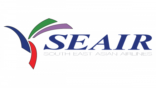
1995 – 2013
In the beginning, the company had the logotype with an acronym of its original name, written in blue font with serifs. Underneath, it features the full name in thin, gray, uppercase letters. The size was adjusted to fit the length of the acronym. On the left of the inscription, there were four multicolored lines turned in different directions. This might symbolize the different directions one could fly with the airline and the exciting adventures ahead. A green and yellow flared above the name, while a blue and red one were placed almost vertically and going in opposite directions, serving as the base for the other two.
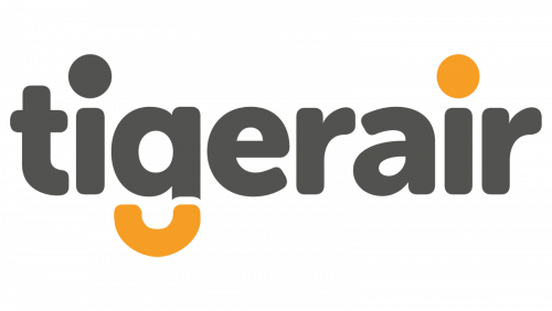
2013 – 2015
The new logo was necessary due to a name change. It spelled out “Tigerair” all in lowercase letters. It chose a dark gray color for the letters. However, there was a bit of orange to add some fun and more association with the tiger. It was a dot above the “i” and the bottom half of the letter “g”, which resembled a curved tail of the tiger. The logo turned out professional with a fit of a fun touch.
2015 – Today
The “Cebgo” logotype of the company depicted the updated name of the company, split into two parts by the blue and green colors. The letters are written in the classic sans-serif font. The use of all lowercase letters and the fact that the font looked very similar to what was used in the previous logo, made it easy to draw some connection between the two.
Font and Color
The company started with a relatively bright and colorful logo. It featured blue, red, green, and yellow, which were meant to reflect the exciting experience one has with the airline. The next logo was more reserved, as it was primarily dark gray. A touch of orange was added to draw a connection to the name – TigerAir. The latest logo featured muted shades of blue and green, which likely stand for sky and grass. The original font was quite fancy with serifs and letters that featured different thicknesses, which created a classic look. Afterward, the company used a more rounded typeface with relatively thick lines.


