S7 Airlines Logo
S7 Airlines is a major Russian airline operating from Siberia. Their list of destinations includes many countries in Europe and Asia, as well as cities across Russia. They are currently the second-biggest airline company in their homeland, and the biggest airline in the Asian part of Russia.
Meaning and History
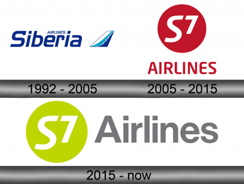
Originally, the company was called ‘Siberia’, and they sported this name since their inception in 1992 until their becoming S7 Airlines in 2006. They also had a history before 1992, in Soviet Union, but it wasn’t a company back then. The current name comes from their IATA identification – S7.
1992 – 2005
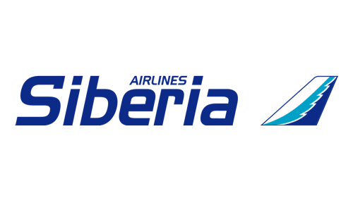
Back in 1992, they were still ‘Siberia Airlines’, and this name was used in the first logo – they wrote it in two parts (‘Airlines’ being much smaller and above the ‘Siberia’ part). Both used plain letters colored in dark blue with just some irregularities, such as notches and weird appendages on the tips.
Their emblem back then was an image of a vertical stabilizer with the winter-inspired illustration of white, azure and dark blue.
2005 – 2015
By 2005, they already switched to the name ‘S7’ and started using the new logo. It was a lime green rectangle with two red parts. The first was a circle that held the writing ‘S7’ inside it. The other was the word ‘Airlines’ written mostly in soft tall letters on the right two-thirds of the rectangle.
The ‘S7’ part was white, and the number was arranged directly opposite to the upper half in ‘S’ to add some symmetric quality.
2015 – today
They largely liked their 2005 logo, which is why the 2015 was simply a rearrangement. The rectangle was gone, and the red circle was colored lime instead. The ‘Airlines’ changed font to a slightly more official-looking typeface, and there was now only one capital letter, as proper. The writing was grey this time.
Emblem and Symbol
The lime color from the 2005 and 2015 emblems actually became the dominant brand color for the airline very quickly. So much so, they paint their planes almost entirely lime. This obviously improves visibility and comprehensibility, although there isn’t really a deeper connotation to this design choice.


